Built to be found – Restructuring a brand's digital architecture for the age of AI search
ROLE
Experience design, content design, strategy
YEAR
2026 - Ongoing
TEAM
Myself as design lead, 1 UX designers
How structural architecture unlocked discoverability across SEO, AEO, and GEO
Singtel.com is the primary digital storefront for Singapore’s largest telco — covering mobile, broadband, TV, and devices for millions of consumers. When a C-suite mandate came down to improve how the site performed across SEO, AEO, and GEO, the instinct was to treat it as a content problem. What we found when we dug in was something more fundamental: the site’s architecture was actively working against discoverability. This is how we fixed it.
THE PROBLEM
When users or AI engines asked questions like “what are the best 5G SIM-only plans in Singapore,” Singtel wasn’t surfacing.
>5,000 URLS with poor redirects and dead-ends
The instinct was to treat this as a content problem. It wasn’t. It was a structural one.
Singtel.com had grown by addition — new pages, new campaigns, new URL patterns — without any shared framework governing how content was created, maintained, or retired. By the time we audited the site, the debt had compounded across every layer.

THE SOLUTION
01
Clean up the foundation
Resolve structural URL debt, eliminate dead ends, and establish robust eform governance policies.
02
Rebuild navigation for intent
A complete redesign of the mega menu organized around customer intent rather than complex internal logic.
03
Create Forever pages
Establish permanent content hubs and high-value landing structures optimized for search & voice discovery.
01: Clean up the foundation
Before anything else could change, the site needed to be structurally sound. A redesigned mega menu or a perfectly optimised landing page means nothing if bots are crawling dead ends, indexing expired campaigns, and splitting crawl equity across two conflicting URL structures simultaneously.
01
Navigation debt
75 URLs in mega menu, 12 mobile entry points, inconsistent headers/footers.
Product-led navigation
Direct terminology, guided landing pages, single header/footer component enforced.
02
Dead ends
626 thank-you pages publicly indexed, no path back into the site.
301 redirects + cleanup
All 626 pages redirected to relevant product pages; dev/test pages removed.
03
Expired content still live
63 discontinued device pages + 38 expired campaign pages, all indexed.
Sunset policy
Device pages 301 to current model family; campaign pages archived + redirected.
04
Conflicting URL structures
Pattern A: /personal/products-services/mobile (1,505 pages) vs Pattern B: /personal/mobile (19 pages) — both live, both indexed.
Clean URL taxonomy
Migrate to singtel.com/mobile/sim-only. Remove “personal.” Publish URL creation framework. 301 all legacy URLs.
05
Eform sprawl
974 eforms (668 mobile + 306 broadband), many tied to campaigns no longer running, no naming convention or expiry logic.
Eform governance
New naming: /eform/product/year/type. Audit against active campaigns. Auto-expiry + 301 on campaign end.
02: Rebuild intent-led navigation
The existing mega menu was built around internal logic, not customer intent. Category labels like “Entertainment” and “Lifestyle” didn’t signal what Singtel actually sells. Internal brand names like “Singtel Superstacker” appeared in navigation customers had never heard of. More than 50% of clicks were going to just two categories — mobile and my account — while the rest of the menu created noise.
We redesigned it around three principles: product-led categories, conversion at the point of hover, and personalisation on login.

The new top-level navigation uses direct product terminology — Mobile, Broadband, TV, Devices & Gadgets, Small Business, Deals. When a customer hovers on any category, they see a snapshot of relevant products and live promotions, with direct entry points into the buyflow. No more routing through a catalog page with no guidance.

Filters inside the hover panel let the business surface more without overwhelming. A customer hovering on Mobile and selecting iPhone sees iPhone-specific deals. A customer selecting Phone with Plan sees bundle promotions relevant to that configuration.
For logged-in customers, the mega menu content changes to show personalised deals exclusive to them. For logged-out customers, it becomes a prompt to log in — with a clear value proposition for doing so.
03: Create "forever pages"
The content for any given product category was fragmented across up to 12 sub-pages, making it impossible for a customer — or a bot — to get a complete picture of what Singtel offered in one place.
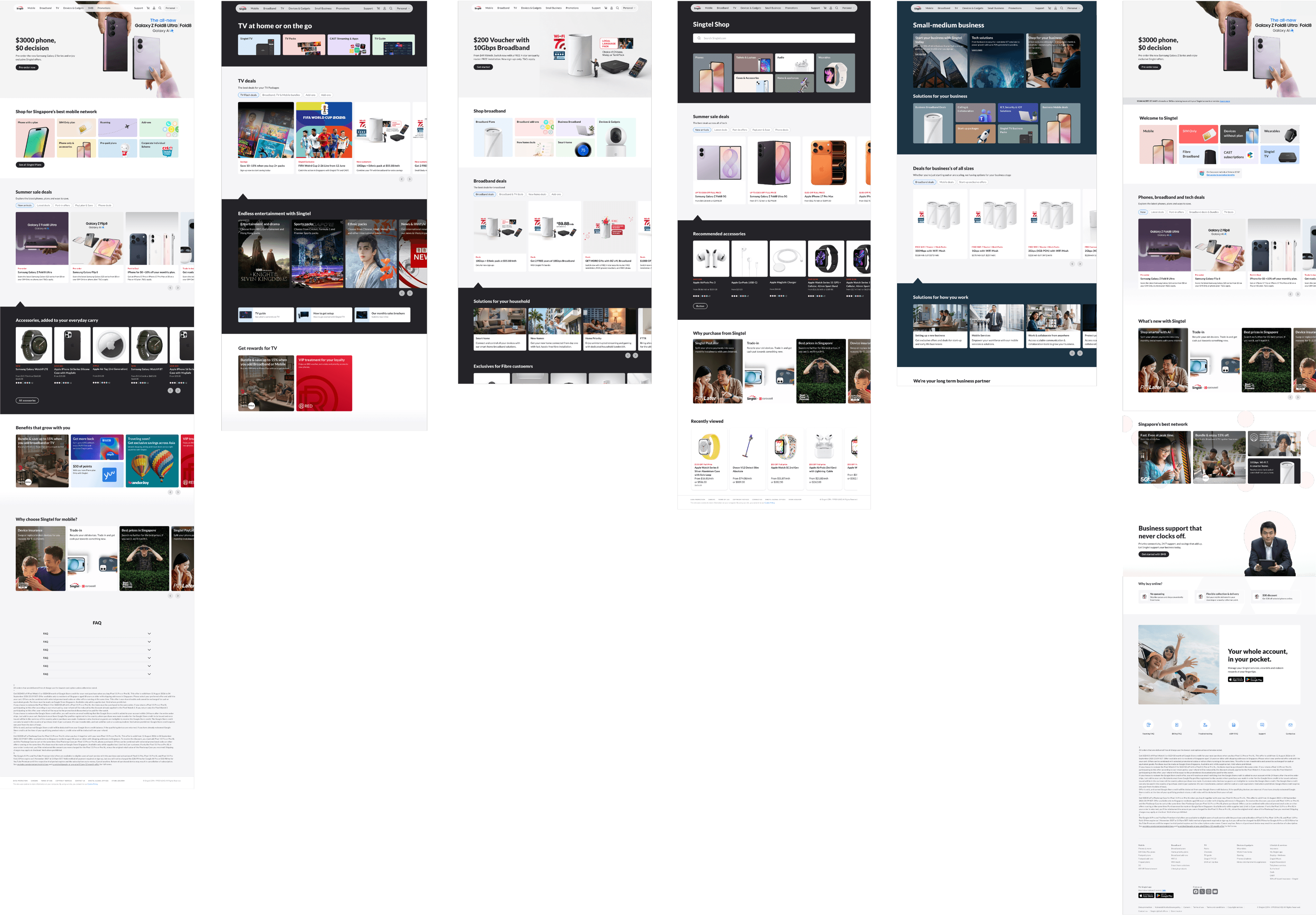
We designed a set of forever pages: one consolidated landing page per product category, built to serve both human visitors and search crawlers. The structure is standardised — one framework applied across Mobile, Broadband, TV, and beyond — so the team doesn’t redesign from scratch for each category.

Each forever page contains what’s latest (new launches, upcoming products with add-to-calendar for pre-orders), a full overview of all products and services in that category, active promos and deals, supplementary content optimised for AEO — for example, under Mobile: “Why 5G+,” “What is eSIM,” “Why Singtel for mobile” — category-specific FAQs, and loyalty context that personalises based on login state.
For logged-in customers, the entire page personalises: exclusive offers surface, loyalty tier and benefits update in real time, and relevant cross-sell recommendations appear based on existing product holdings.
The "Why Singtel" page
The forever pages carry AEO-optimised content, but they aren’t exhaustive. We needed a catch-all: a single page specifically built to answer the question a user or AI engine might ask before choosing a telco.
The Why Singtel page consolidates everything that makes Singtel the stronger choice — loyalty programmes (Singtel Prestige, Singtel Circle), key partnerships (UOB, TCG Access, WonderJoy cross-border rewards), network strengths, and Singtel Block, which had already shown a measurable lift in AEO performance.
APPROACH
This wasn’t a redesign that could ship all at once. With over 5,000 URLs, active paid ads pointing at legacy paths, and printed materials referencing existing links, any structural change had to be sequenced carefully to preserve SEO equity and avoid breaking live customer journeys.
We approached the migration in phases — highest-traffic pages first, moving batch by batch into the new URL framework and forever page structure. Each batch was validated before the next was released.

EARLY RESULTS